GNOME 3.0 with GNOME Shell has received more discussion than any Linux desktop changes in a long time. Now that Fedora 15 is out, we've finally got a chance to see the final result — and decide whether the desktop has been worth the wait.
Of course, there's more to Fedora 15 than just GNOME Shell. The release has a laundry list of new features, some of which are relevant to desktop users, some of interest to developers, and some that make a difference to system admins. But for the purpose of this feature, I'm strictly looking at the main Fedora desktop release. See our 7.5 reasons to upgrade to Fedora 15 for other features you might enjoy in the latest release.
I do want to point out that Fedora is not just the GNOME release. You'll find several Fedora Spins that have alternative desktops — so if you're a fan of KDE, Xfce, or others, Fedora still has you covered. But we'll focus on the main desktop here because that is the default.
First, let's look a Fedora as a desktop user. Installing Fedora hasn't changed a great deal since the previous release. If you've never installed Fedora before, it's not terribly difficult. The installer is a bit more involved than what users will be used to if they're coming from a distribution like Ubuntu or another OS like Mac OS X. It requires that you have some understanding of Linux and know the difference between a regular user and root, for example.
However, once the install is done you are quickly and painlessly presented with display manager to log into your desktop — in this case, GNOME 3.
Let's talk GNOME. For the last few years, I've spent quite a bit of time in GNOME and have gotten quite used to the GNOME 2 way of doing things. This doesn't mean that the GNOME 2 way of doing things is better, but I'm used to it. I'm also open to change if it's for the better. So is GNOME 3 a change for the better, or just change?
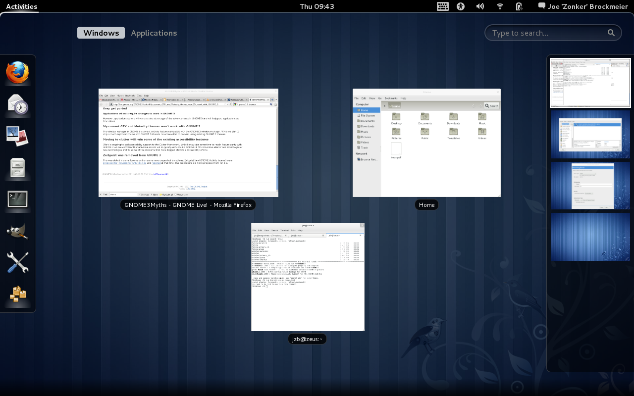
I'm going to say it's a bit of both. My take on GNOME 3.0, as delivered in Fedora 15? I think it has promise, but it definitely needs work. The decisions to, for instance, remove the maximize button, are questionable. The decorations on the windows are pretty chunky, and on a small display (I tested F15 on a older laptop with 1280x800 resolution) every pixel counts.
And let's talk look for a second. You can have any color you want with GNOME 3.0 in Fedora 15 — as long as it's black. Well, the outer theme, anyway. The window dressing is a light gray. The black theme is, for me, a bit oppressive. It probably works very well for users who are visually impaired — the contrast is good — but it's a bit goth for me. There's a "myths" page that dispels the myth that older themes won't work with GNOME 3.0. That's true, to a point, but it doesn't change the fact that they don't ship any other themes or tools to change the themes.
You can, however, install the GNOME Tweak Tool to change some of the things you used to be able to change via the GNOME Control Center. For example, you can change the themes or add the maximize and minimize buttons to the windows.
That said, I like some things about GNOME Shell. I am not crazy about the panel, but I like the window tiling and the ability to search through windows. I like the way it creates workspaces. I'm not crazy about missing the keybinding (Ctrl-Alt-right or Ctrl-Alt-left, etc.) for switching between workspaces. Obviously, the vi-loving, shortcut-knowing crowd is not the audience the GNOME folks had in mind here.
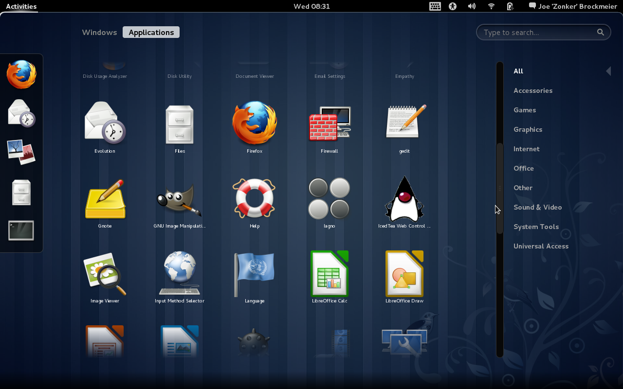
The application picker needs some clean-up. Instead of choosing an application from the GNOME Menu, you now have a application picker that displays all the program icons in a grid, plus "favorites" on the side. You've seen similar layouts on Android phones and devices running iOS. This looks great mostly — but I find the actual categorization a bit muddled and some of the icons aren't meant to be scaled up as large as they are in the picker, so they look terrible. The favorites need some work as well. There's no obvious way at the moment to change the icons associated with the favorites. I've added the Tweak Tool and System Settings to the favorites, but both have the same icon.
With Shell, you also "lose" the desktop as a place to plop files and shortcuts, and no more right-clicking on the desktop to open a terminal. Yet you still have the Desktop folder to save files to. Not sure this makes sense. I'm disappointed that the GNOME project has never implemented something like the KDE plasmoid for the desktop, which is one of the KDE 4.x features I really like. You can restore this by going into the Tweak Tool and setting "Have file manager handle the desktop."
Compositing Conundrum
The biggest thing that annoys me about GNOME Shell is that it requires compositing, thus requiring supported 3D hardware and ruling out some of my hardware and running GNOME Shell in VMware. Guess who has two thumbs and likes to be able to use distros in VMware when traveling? This guy.
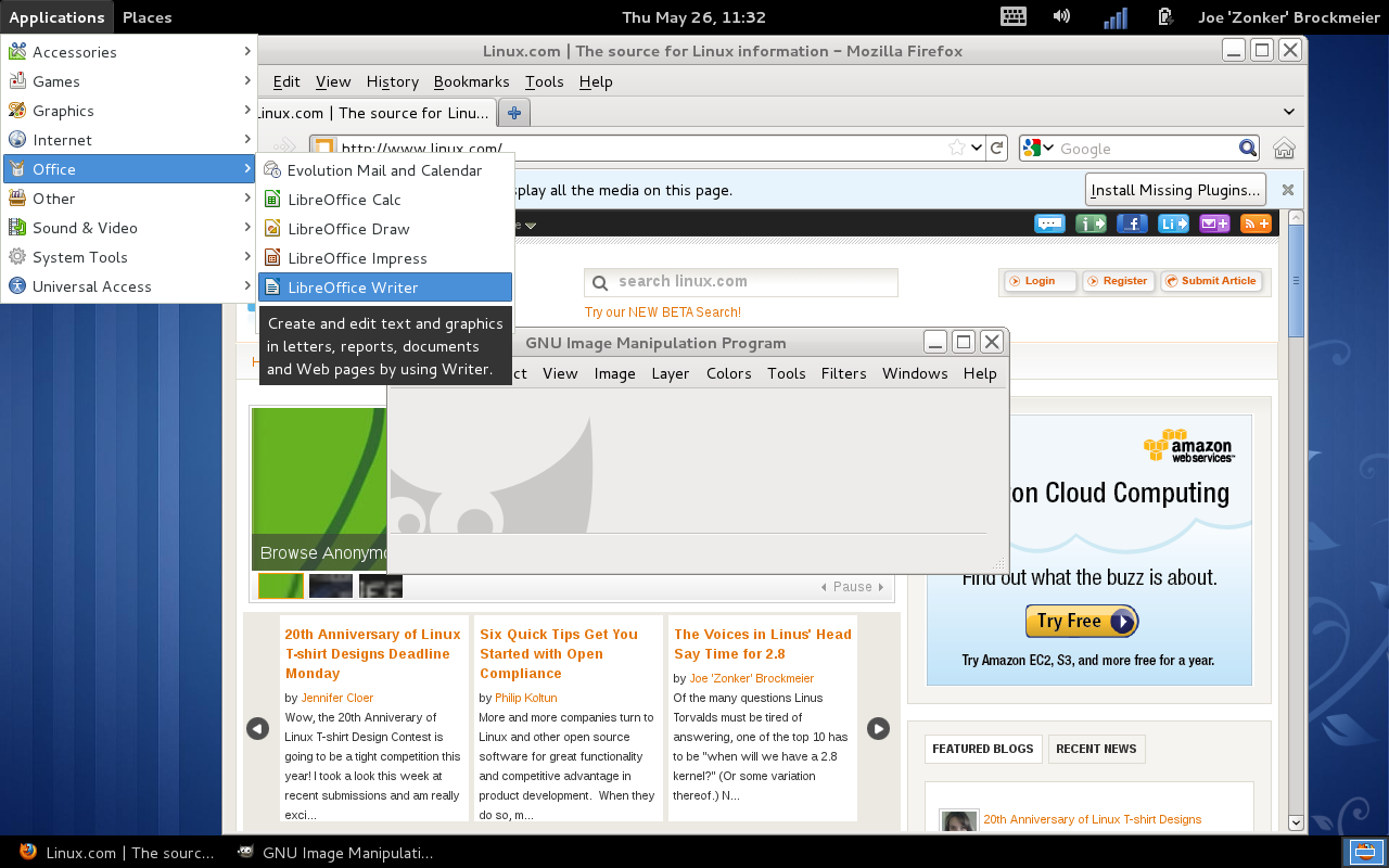
You're not totally out in the cold without supported 3D hardware, you just wind up being dropped to the fallback or having to choose a different desktop. But the fallback option, frankly, isn't as good as either GNOME 2 or GNOME 3 with GNOME Shell.
The panel that ships with Shell has some nice ideas. I like the calendar/to-do integration with Evolution, though I'm usually not an Evo user. I miss the time zones, though. It took me a bit to realize that the mouse and other Accessibility options had migrated to the Panel and the Universal Access control dialog. It initially looked like those options were dropped altogether, but they've just been moved out of the mouse/touchpad settings and into Universal Access. This probably does make more sense, it just confused me because I'm used to the old way of doing things.
We'll call GNOME Shell a mixed bag. It has promise, some obvious nifty features, and a bit of improvement ahead. It will also require that most users re-think the way that they use the computer a bit. This requires a bit of an open mind — but we're creatures of habit. We don't necessarily want to have to re-approach our UI with an open mind.
Software Selection and More
Looking at the default selection of software, Fedora hasn't changed greatly since Fedora 14. They have swapped out OpenOffice.org for LibreOffice, and you have Firefox 4, Empathy for IM and IRC, and so on. No surprises or big new packages, really.Naturally, the default selection of software is always missing at least one tool that most of us want. How is Fedora 15 when it comes to handling packages? Overall, good. Most of the software I'd want that wasn't installed by default was available from the default repos, and the PackageKit GUI is easy to use.
But not all is perfect in packageland. One of the things I've consistently run into with Fedora over the years is problems installing packages. This run was no different. For instance, I tried to install a package called gnotime and received an error about "An unspecified transaction error," because "gnotime-2.3.0-8.fc15.i686 requires libgtkhtml-3.15.so.19." This wasn't the first error I ran into. I can't recall the last time I ran into a similar error using another major distribution's stable release. Worse, the dialog that tells you that you have this problem doesn't let you fix it. You have to confirm the error and then wade back into the software selection to uncheck the offending package. This kind of error is the sort of thing that annoys the heck out of experienced users, and sends inexperienced users running for the hills — or, worse, back to Windows.
Naturally, Fedora doesn't provide codecs for things like MP3 playback and doesn't ship non-free software like Flash. The project has perfectly valid reasons for doing so, both legal and philosophical — but that doesn't change the fact that this is an additional hassle for users who want or need those things.
After using the final Fedora 15 for a few days, I've gotten used to its quirks and been able to tame it to my liking. So it's suitable for use, if you know what you're doing. But it's not perfect or close to perfect out of the box for my use, like Linux Mint.
Summary
Despite a few harsh words, I actually like Fedora 15 — and I could warm to GNOME 3 and Shell if they fix some of the problems and give the user more control over the desktop.A big problem for Fedora, and for just about any Linux distribution, is trying to figure out who the audience is. The design philosophy for the default desktop, GNOME 3, seems to focus on new users. The rest of the Fedora distribution is aimed at power users and developers. I feel a bit of a disconnect there. But I plan to spend a lot of time using Fedora to see if I don't warm to GNOME 3 more than I did initially, and writing up a few tutorials on using SELinux tools and so forth.
Should you try Fedora 15? If you're a power user, definitely. If you're a less experienced user, then you might want to try Fedora 15, but not on your main computer. I would not recommend using Fedora as a go-to Linux distro for friends or family that haven't tried Linux before.
If you're a loyal Fedora user who's been on the GNOME desktop, you have a couple of options. If GNOME Shell doesn't appeal to you, there's the option to force the "fallback" mode. You could also sit out the F15 release and wait for F16 and the next GNOME release. I suspect it will fix a lot of the problems (read: restore functionality that was unwisely removed) that 3.0 has.
Another option? Try the Xfce release for a cycle. Xfce is feeling a lot like GNOME 2, and that's not a bad thing.
In a nutshell, Fedora 15 is a typical Fedora release. It's solid, but there's a few bugs and the thrill of living on the edge of development. Sometimes that means exciting new features and sometimes it means being annoyed that something that worked perfectly a release ago is off the table while it's re-implemented. But even if you don't use Fedora on your own machine, the odds are the work that's being done in Fedoraland will ultimately benefit you as a Linux user.
View the original article here


No comments:
Post a Comment